EXHIBITIONS
Pentagram 11 Needham Road, Harry pearce.
Pentagram is a design company. There company has existed for 50 years and works internationally covering all areas of design including, architecture, interiors, products, identities, publications, posters, books, exhibitions, websites and digital installations. The exhibition that I went to focused on typography and logos for e.g. Kings College, V&A, Nissan. Harry Pearce showed us his work how he traveled and took pictures of typography wherever he saw it. That inspired me to see the possibilities of research and inspiration everywhere around me. I particularly liked the V&A logo as it is bold and stands out.
Paper Gallery, Goodge Street.
One of the designers features is Helen Friel who describes herself as a paper engineer. All of the work displayed was made entirely out of paper. Most models were quite big were usually big things are not normally made out of paper. It shows paper is a strong material and one that is normally overlooked. I particularly liked the 3D typeface and the biscuit machine as it was very detailed and decorative. They mimic things that are real which makes them fun. This expanded my boundaries how I can make anything with any material and that design does not have to have a function other than to be decorative.
HOME
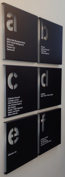
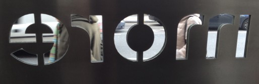
Cartlidge Levene, Morelands, 5-23 Old Street.
Cartlidge Levene specialize in way finding and signage. One of their clients is V&A. They designed the system where and how visitors go around the gallery.
The image with the big '3' on it is very clear, it does not look like a sign because it is almost architecturally integrated into the building so could be part of the building itself. Whereas in the Tate Modern image their sign information is listed in different categories. The signs fir in with the surrounding environment, because everything on the walls of Tate are big canvasses and the signs are on big canvasses also. Whilst I found this the least interesting of these exhibitions I can see that way finding and signage is a really important and unusual area of design.
Museum of Brands, Packaging and Advertising, Notting Hill.
It was an interesting experience as you can get a first hand look at the evolution of advertising and packaging from about the 1920's to this present moment.
I found out that a lot of things have changed in advertising. For example, advertisements nowadays are less sexist towards women, as we slowly grew out of the patriarchal era.
For example a Fairy Liquid ad, clearly states who the product is directed to; women. Whereas now, lets say a nail polish advert does not blatantly emphasize who their audience is.